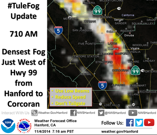
Tweeted Message from the National Weather Service in HNX (Hanford, CA) showing GOES-R IFR Probabilities in the central Valley of California (click to enlarge)
The National Weather Service in Hanford tweeted the image, above, of IFR Probability this morning. How did the evolution of IFR Probabilities compare to that of brightness temperature difference fields?
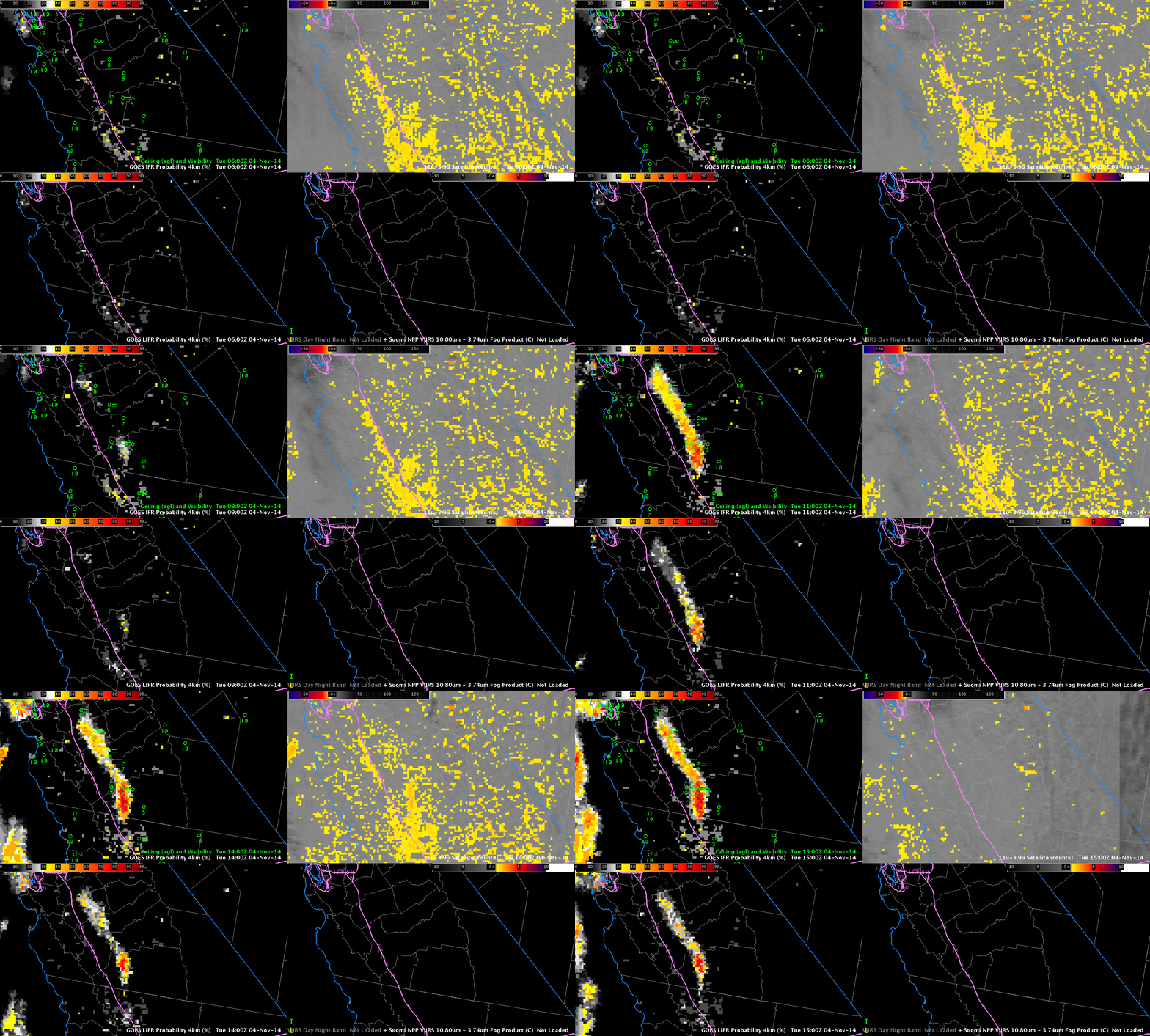
The hourly animation, below, suggests that data from the Rapid Refresh model was likely crucial in determining exactly where the lowest visibility occurred; the brightness temperature difference field did not capture the horizontal extent of the narrow band of fog that developed to the east of Interstate 5 (The interstate is the purple line in the animation). Indeed, the brightness temperature difference field appears to offer little in the way of forecast value, and differences trend to zero as the sun starts to rise at the end of the animation. In contrast, both IFR and LIFR Probabilities have peak values where ceilings are obscured and visibilities are near zero, in and around Hanford, and those large values persist through sunrise.

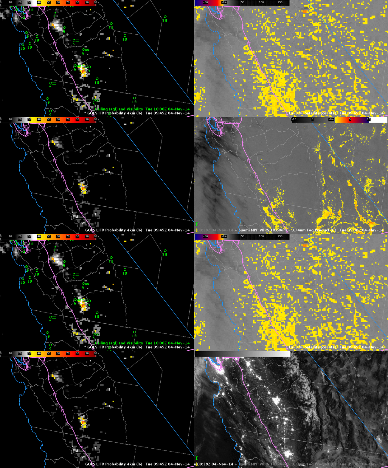
Hourly GOES-R IFR Probabilities (Upper Left, computed with data from GOES-15) with ceilings and visibilities plotted, Hourly GOES-R LIFR Probabilities computed with data from GOES-15 (Lower Left), GOES-15 Brightness Temperature Difference (10.7µm – 3.9µm) (Upper Right), Suomi NPP Day Night Band and Brightness Temperature Difference (11.45µm – 3.74µm) (Lower Right), times as indicated (Click to enlarge)
Suomi NPP overflew the central Valley at 0938 UTC. The Day Night Band and the brightness temperature difference (11.45µm – 3.74µm) field, below, do not contain signatures of dense fog near Hanford.
The two-hour time-lapse video, below, shows the evolution of the Fog at the National Weather Service Office in Hanford on the morning of 4 November.

